Designing transparent verification states for supplementary insurance eligibility.
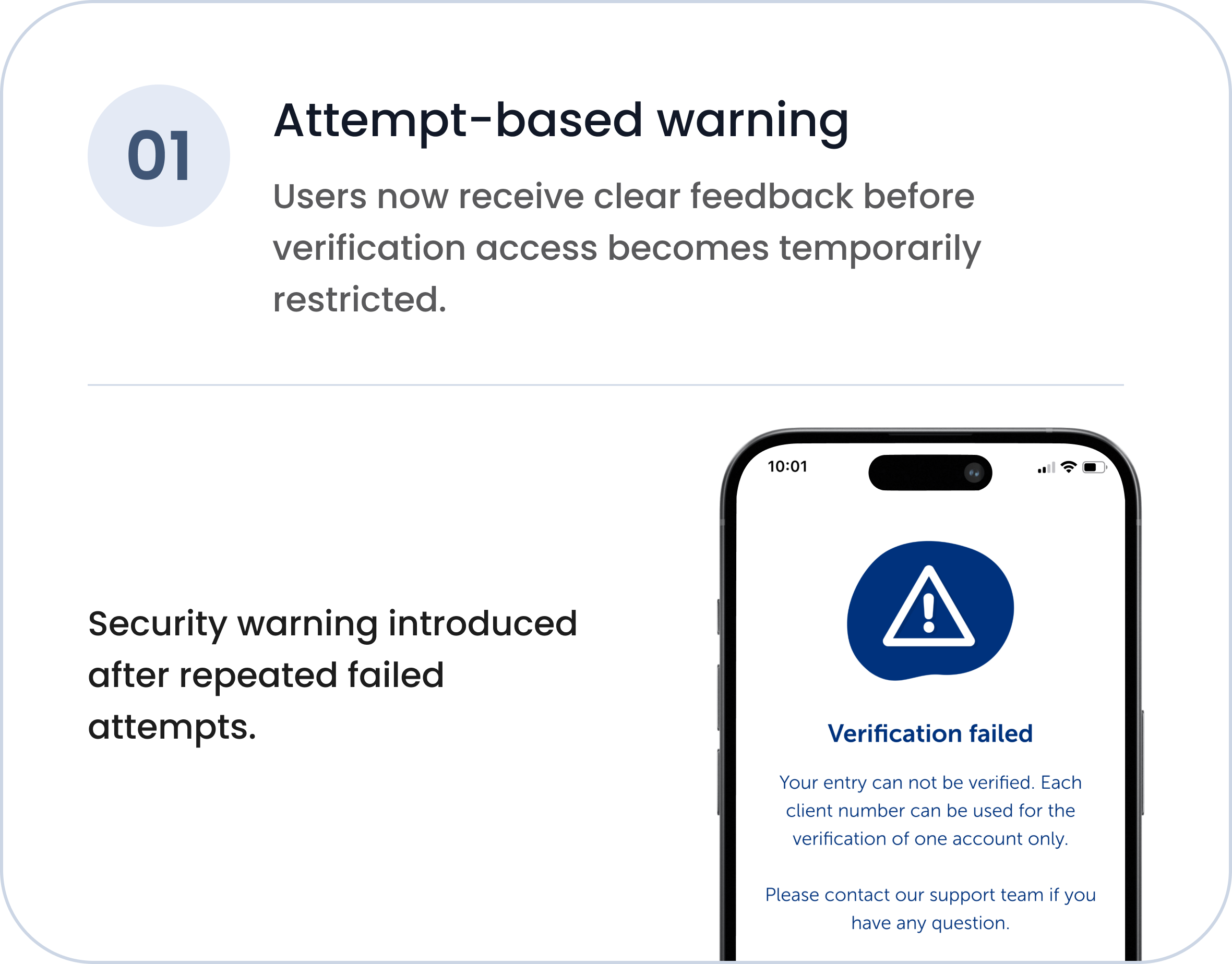
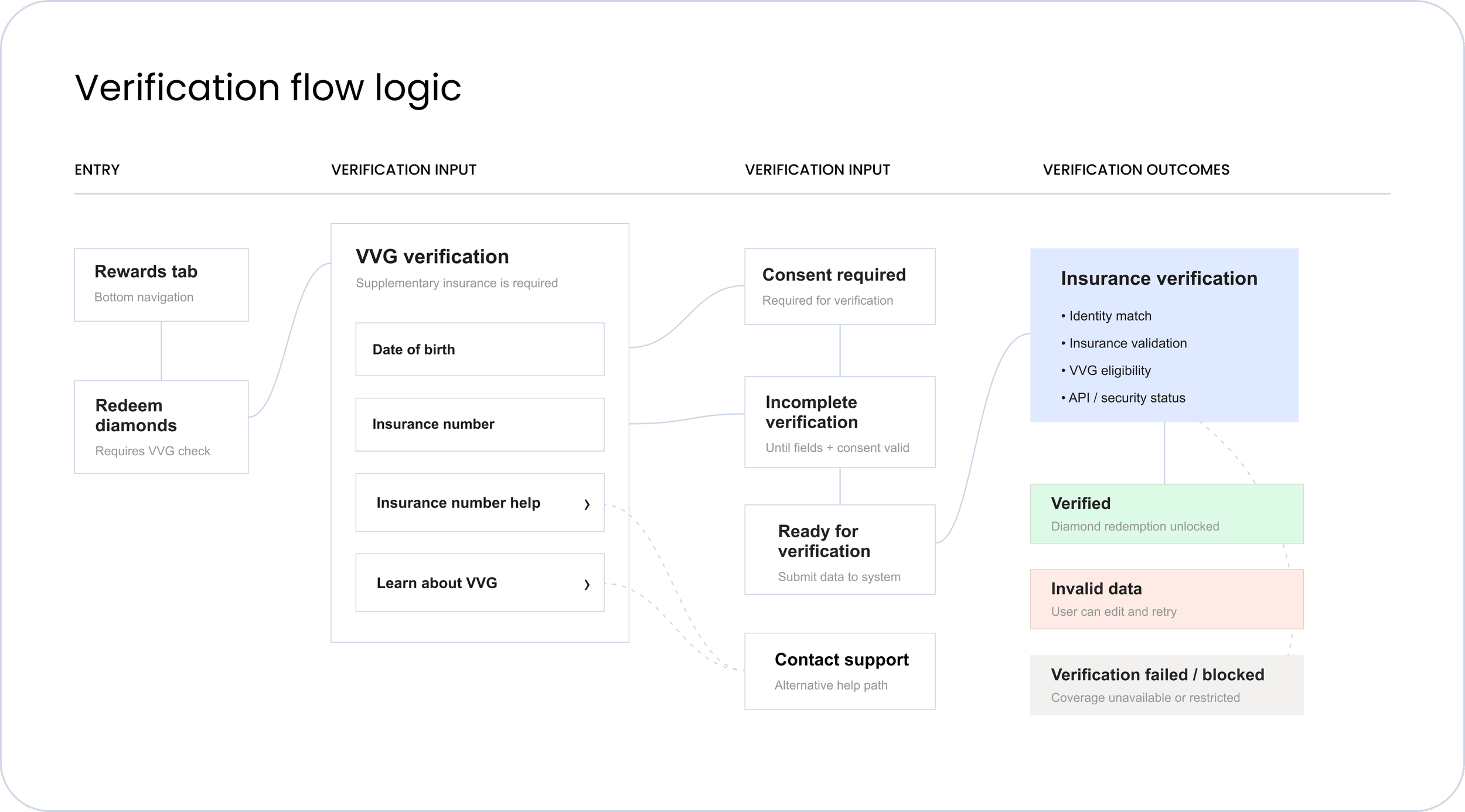
Role — Product Designer Focus — Systems UX, verification logic, UX writing Platform — Mobile AppScope — Verification flow, system states, support guidanceUsers could redeem diamonds only if supplementary insurance (VVG) eligibility was verified.
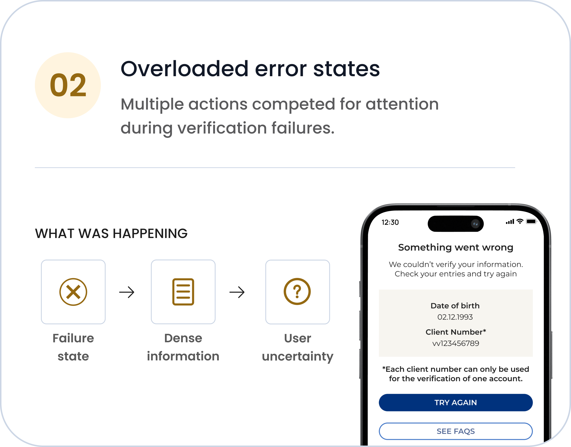
The existing flow treated multiple backend and eligibility scenarios as the same generic failure state, creating confusion, unnecessary retries, and support requests.
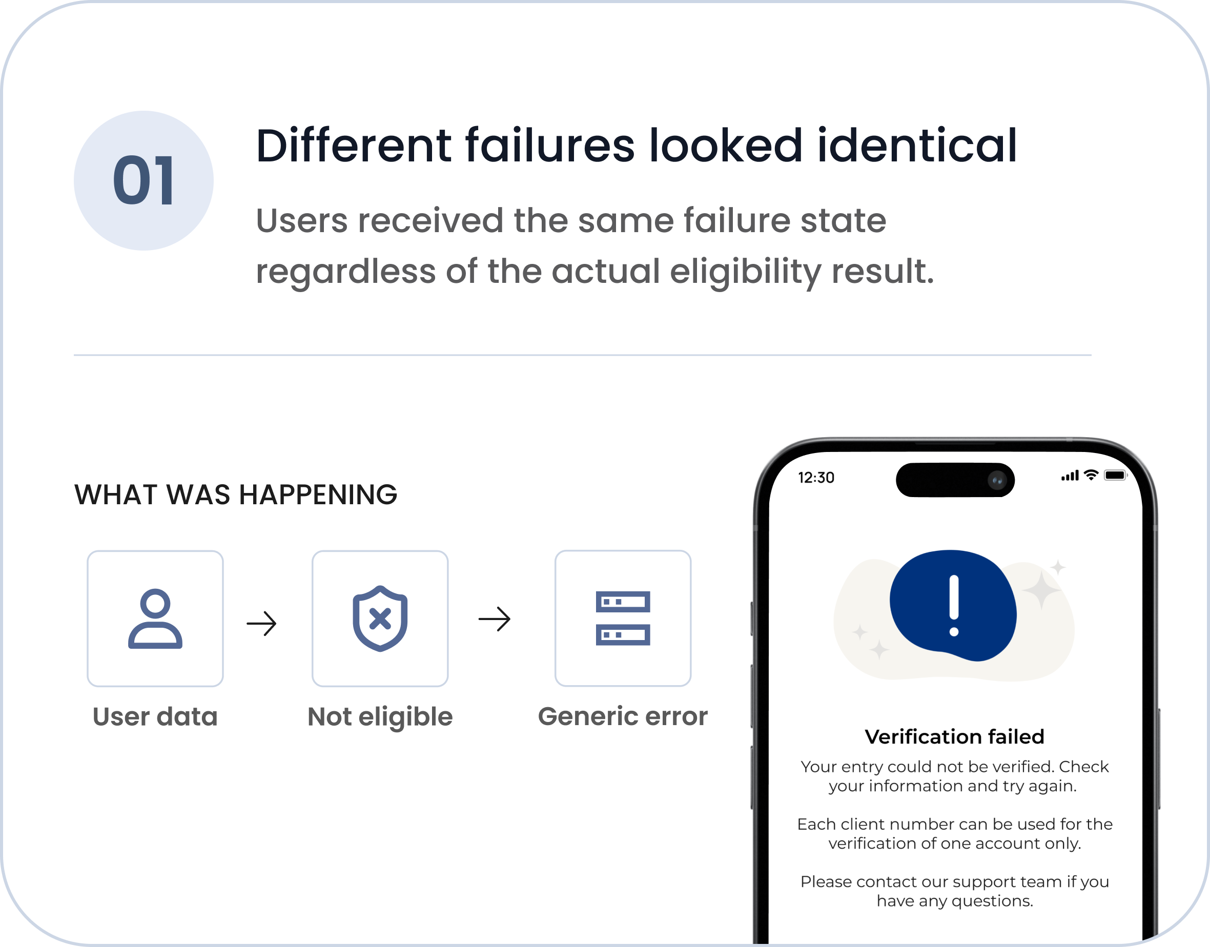
One failure.
Many reasons. No guidnens
The previous verification flow returned the same generic error message for multiple backend scenarios. Users didn’t know what went wrong or what to do next.
Verification flow logic
Different backend outcomes shared the same user-facing states, creating ambiguity around verification failures and next steps.
Design decisions
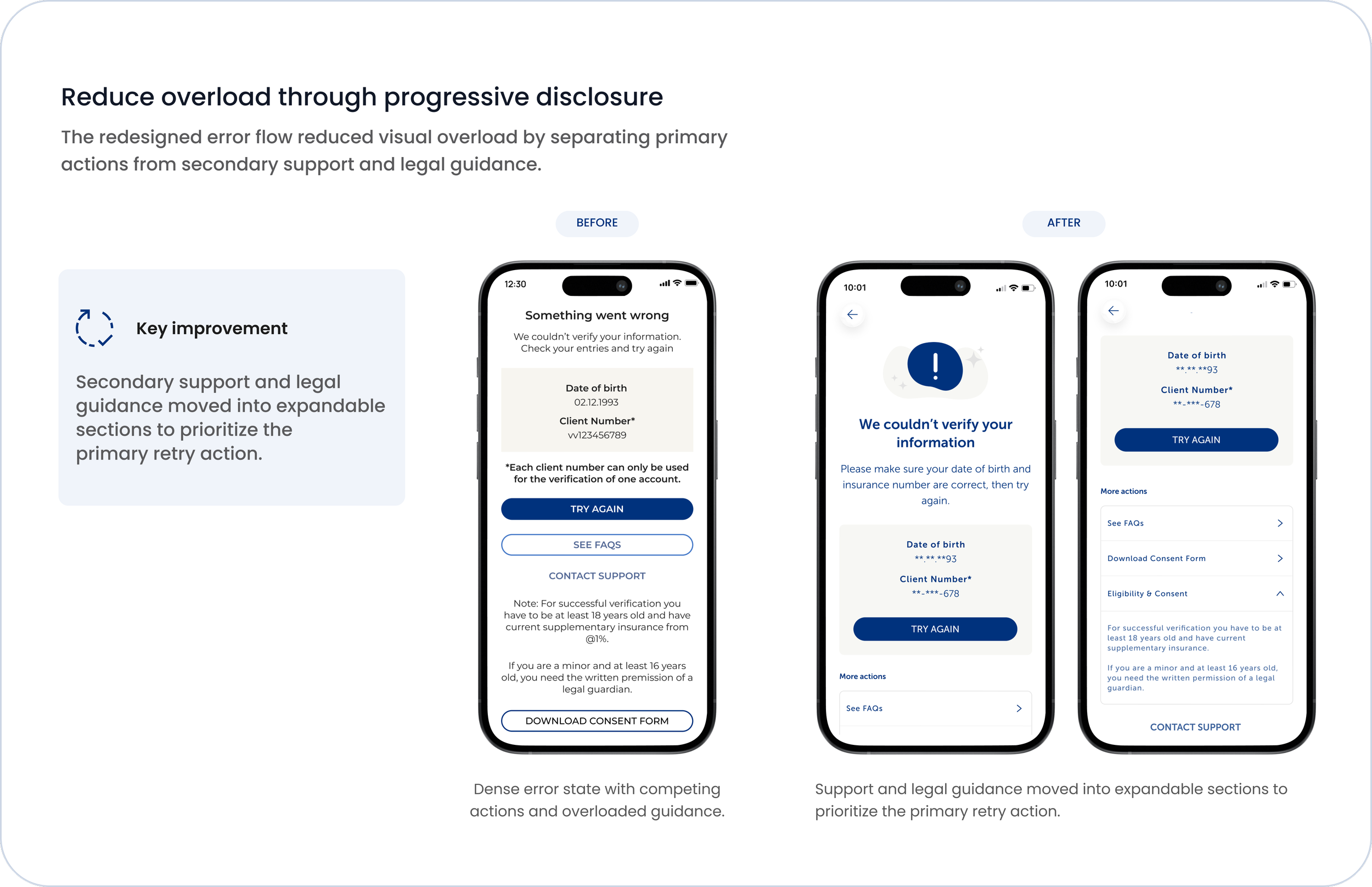
The redesign focused on making verification states more understandable, actionable, and cognitively manageable.
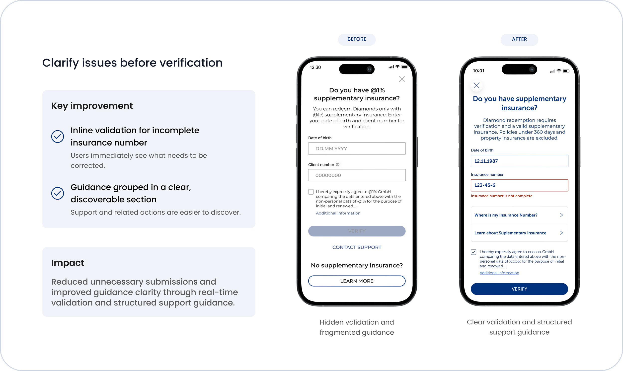
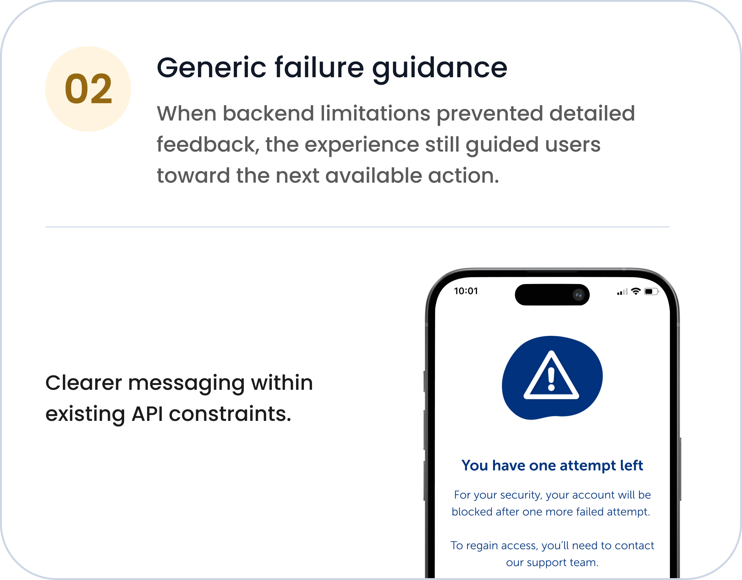
Introduce clearer security feedback
The redesigned failure states improved communication around verification limits while keeping sensitive account information protected.