Yandex Auto - Onboard Computer Experience
My Role: UX UI Designer Focus: Customisation, clarity & safe interactionProduct: In-car information system Yandex Auto is an onboard computer system that integrates navigation, media, phone connectivity, and system controls directly into a vehicle’s interface.
Drivers rely on it while driving, often in short, high-pressure moments, which makes clarity and predictability critical.
My work focused on rethinking the home screen experience to better support personalisation—without increasing cognitive load or compromising safety.
The challenge
Drivers use cars differently - some focus on navigation, others on music or calls; some want minimal info, others everything at a glance.
The existing system was rigid: fixed layouts, limited widget sizes, and little flexibility to arrange information naturally.
The core challenge was finding the balance between flexibility and control:
How could we give users more freedom to customise their experience while keeping the interface calm, predictable, and safe to use while driving?
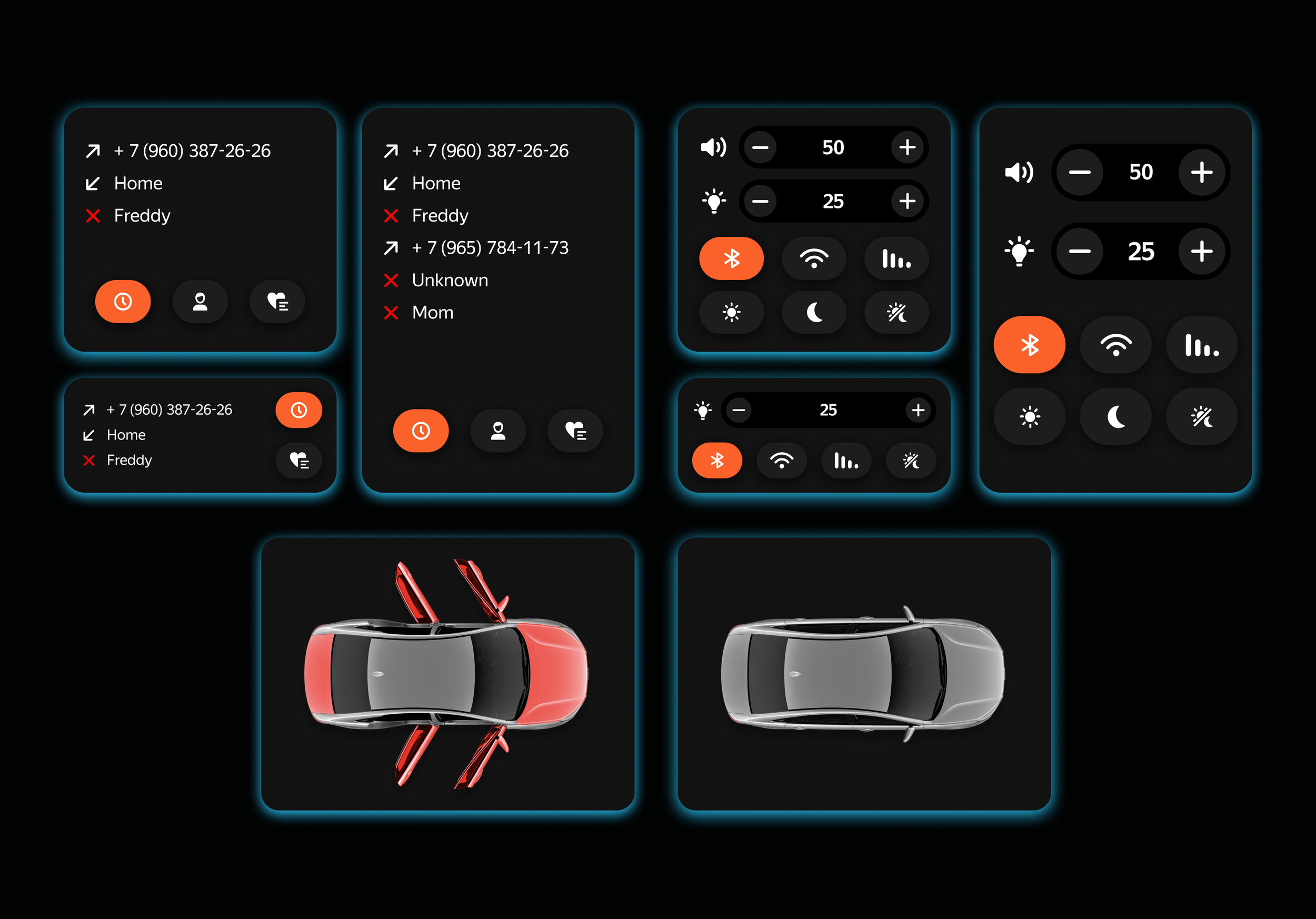
A modular approach to the home scree
To support personalisation in a controlled way, I worked on a modular grid system that acts as the foundation for the entire home screen.
Instead of freeform placement, widgets snap into predefined grid blocks.
This allows users to resize and rearrange content while keeping alignment, spacing, and visual rhythm consistent.
The grid makes flexibility feel intentional rather than overwhelming - and ensures the interface remains readable at a glance.

Widgets as adaptable building blocks
With the grid in place, widgets became adaptable building blocks rather than fixed elements.
Each widget was designed to work across multiple sizes, adjusting content density and hierarchy depending on available space. This allowed drivers to prioritise what matters most to them without losing essential information.
The goal wasn’t to show more - it was to show the right amount of information at the right time.
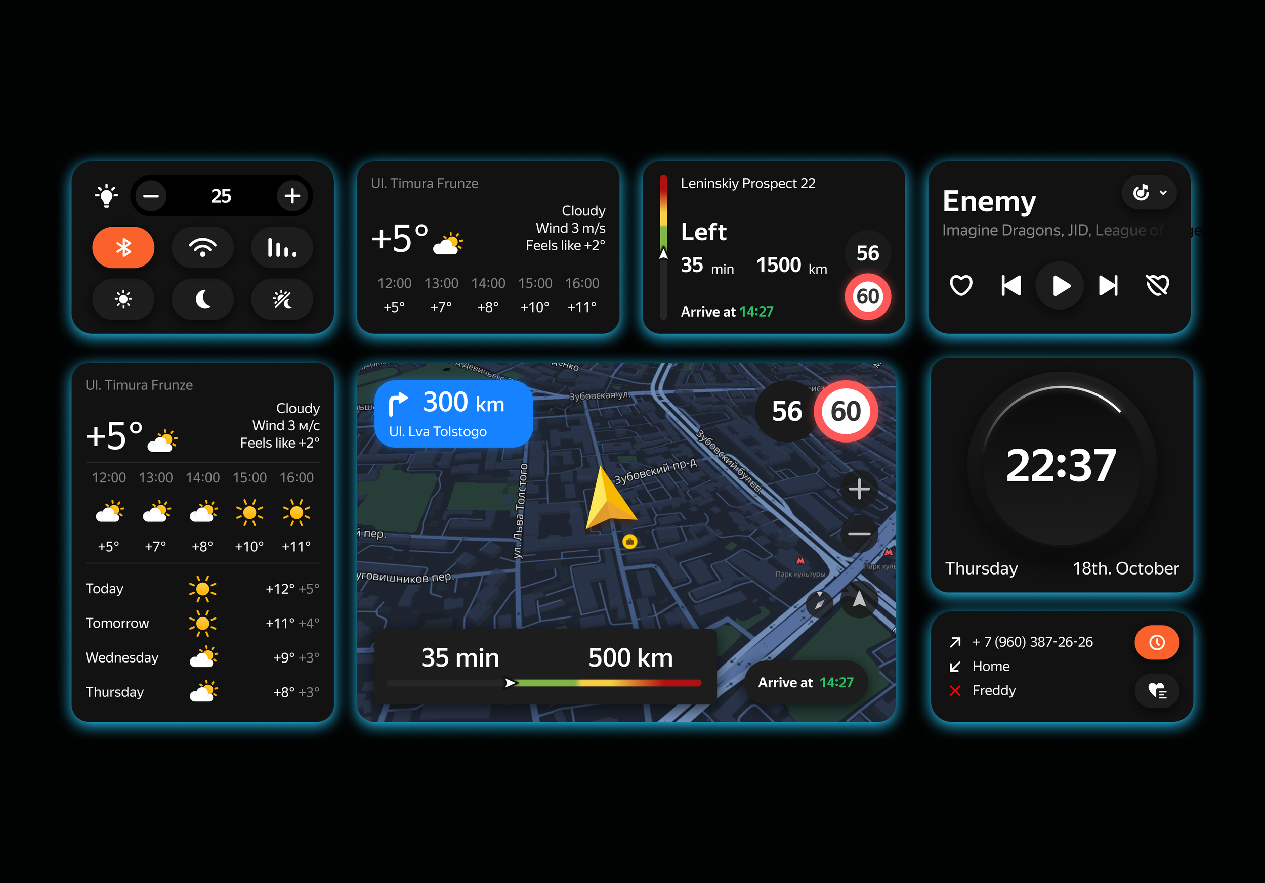
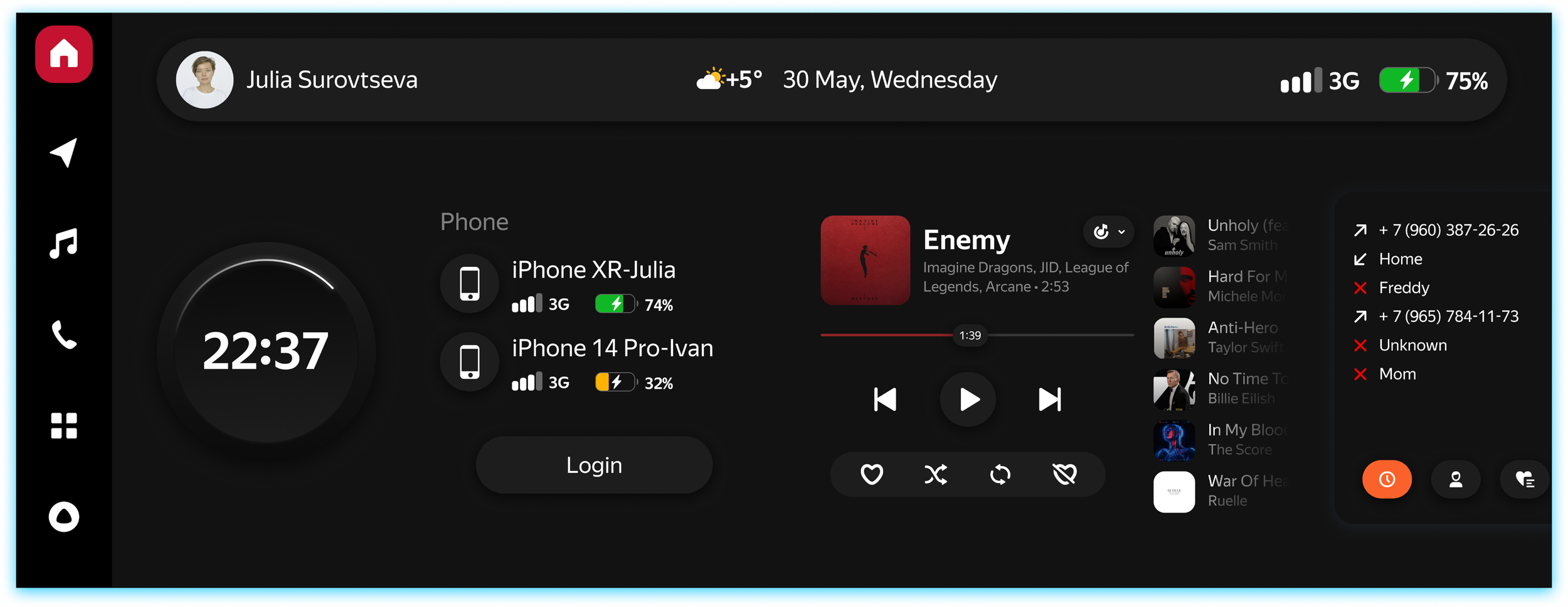
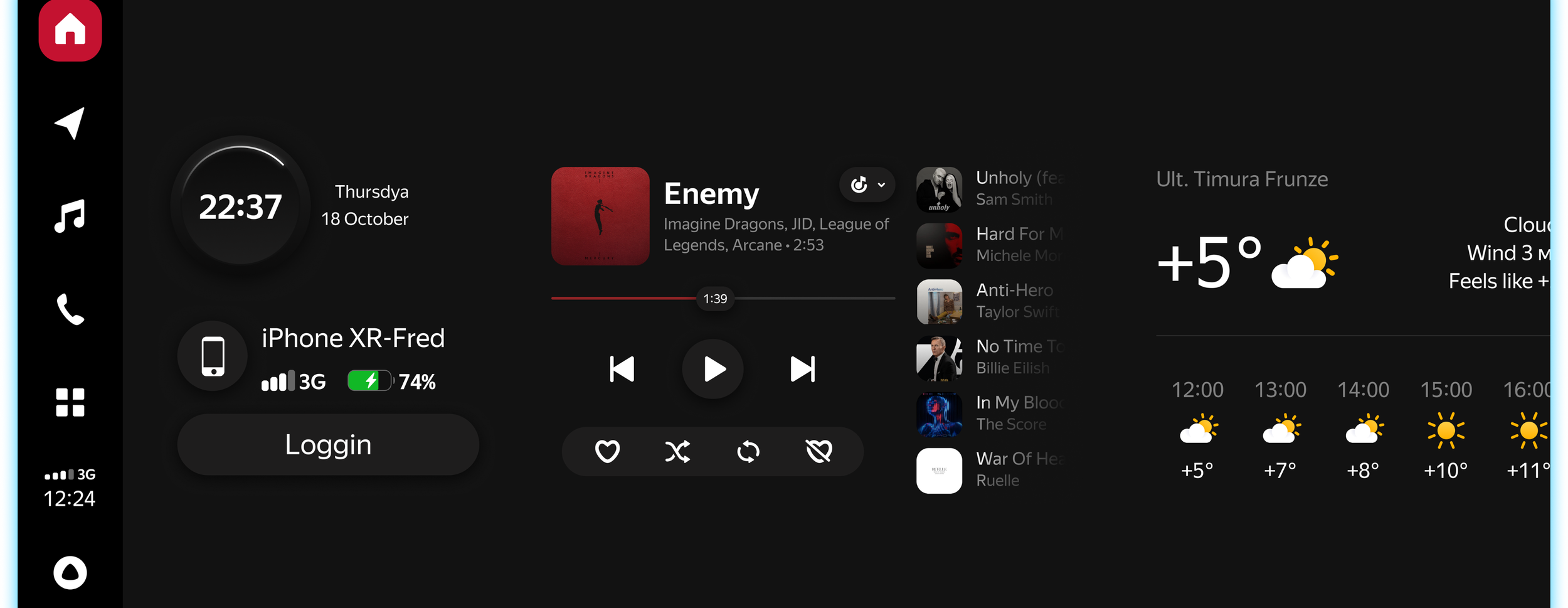
Screen real estate in a car is limited, so every pixel matters.
We explored an enhanced status bar concept that acts as a persistent, lightweight information layer. It surfaces key contextual information -such as connectivity, weather, and media - without interrupting the main layout or demanding extra interaction.
This approach allowed the home screen to stay focused while still keeping important information accessible.
Using the status bar as an information layer
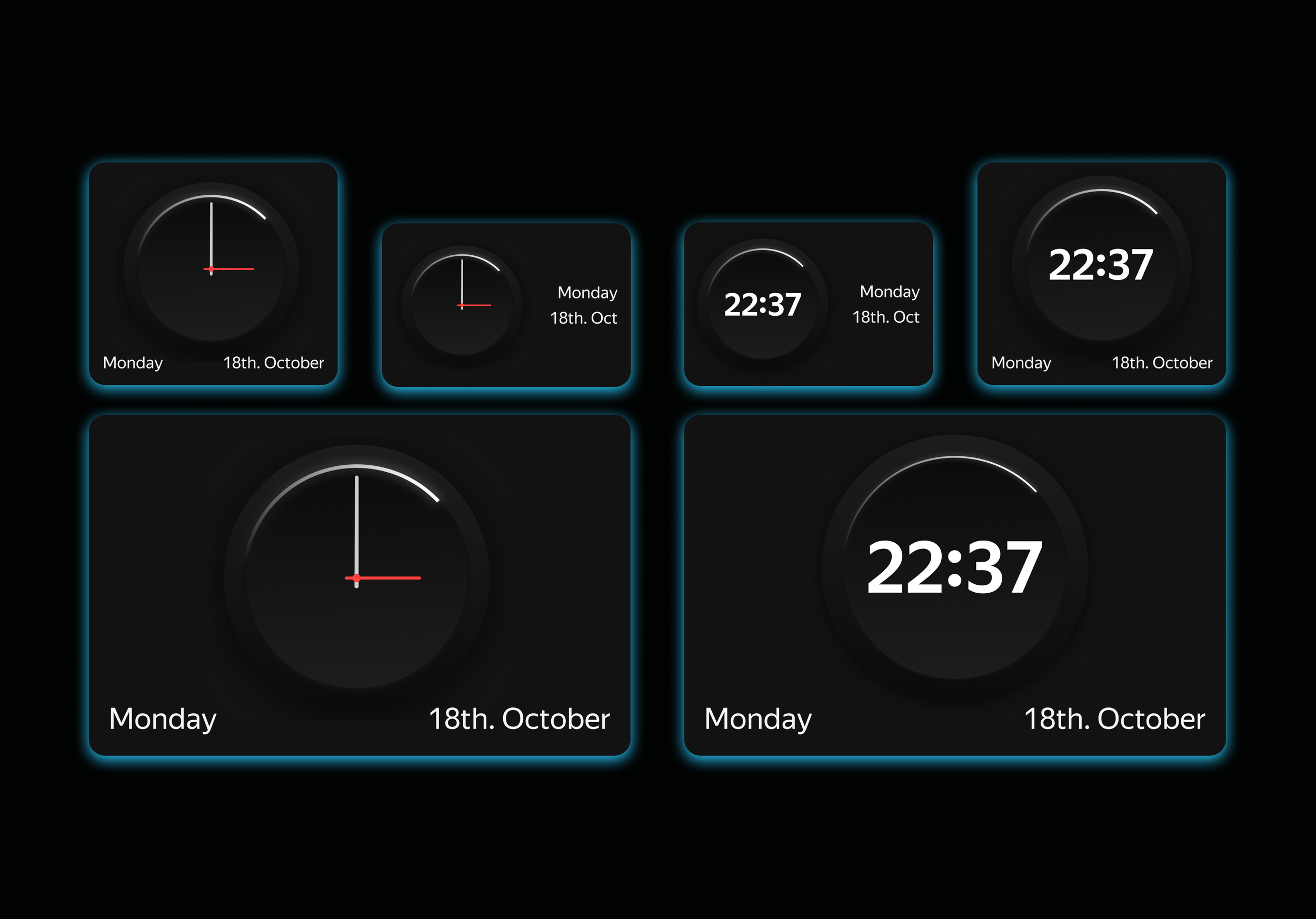
Rethinking time and information hierarchy
Screen real estate in a car is limited, so every pixel matters.
We explored an enhanced status bar concept that acts as a persistent, lightweight information layer. It surfaces key contextual information -such as connectivity, weather, and media -without interrupting the main layout or demanding extra interaction.
This approach allowed the home screen to stay focused while still keeping important information accessible.
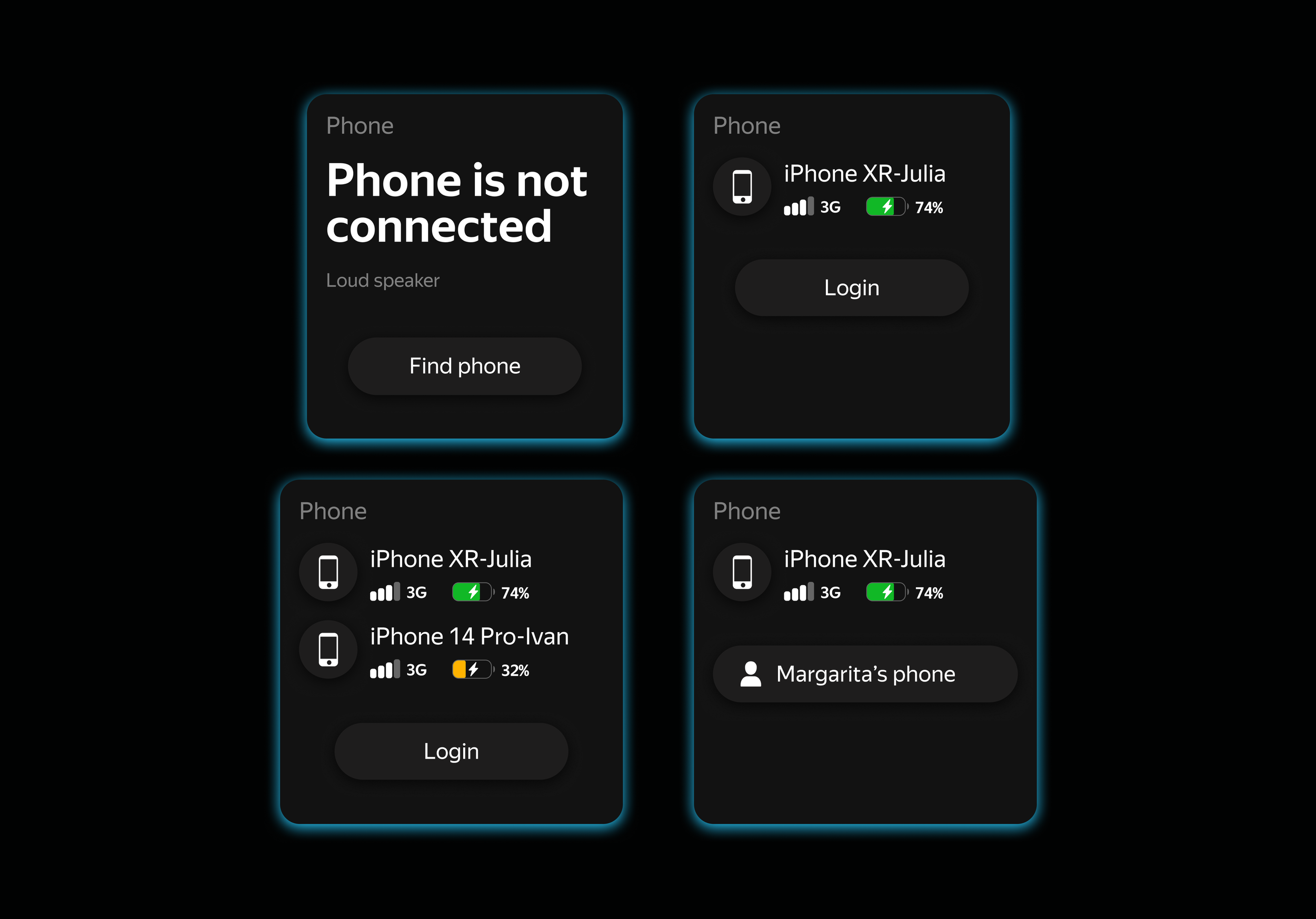
Handling real-world complexity
One of the more complex scenarios involved representing the state of multiple connected phones at the same time.
Presenting this clearly, without visual clutter, required careful prioritisation and grouping. The solution focused on showing only the most relevant information by default, with secondary details available when needed.
Outcome & learnings
This project helped define a scalable foundation for the Yandex Auto home screen, based on shared grid logic, reusable components, and consistent interaction rules.
It reinforced a key lesson I still apply today: flexibility only works when supported by strong structural foundations.
This way of thinking continues to guide how I approach design systems and system-level product design.